Some of the tensest debates between Marketing, Sales, execs, and LDRs center around performance. How much pipeline exists? Who “gets credit” for sourcing pipeline? Are leads being worked? Usually the source of the agita is in reporting. Every team creates their own reports with slightly different dimensions and filters. One team references Lead Source, and another Campaign Source. Our sense of reality (and responsibility) wiggles apart. Soon we have conflicting narratives, we don’t trust the data… and things get really miserable. The antidote? Co-create (and then exclusively use) comprehensive Salesforce dashboards that track all our key metrics. In this post, we’re sharing great Salesforce dashboard examples from our client base.
>> Related: The Best Marketing Board Slides We’ve Seen <<
In this post:
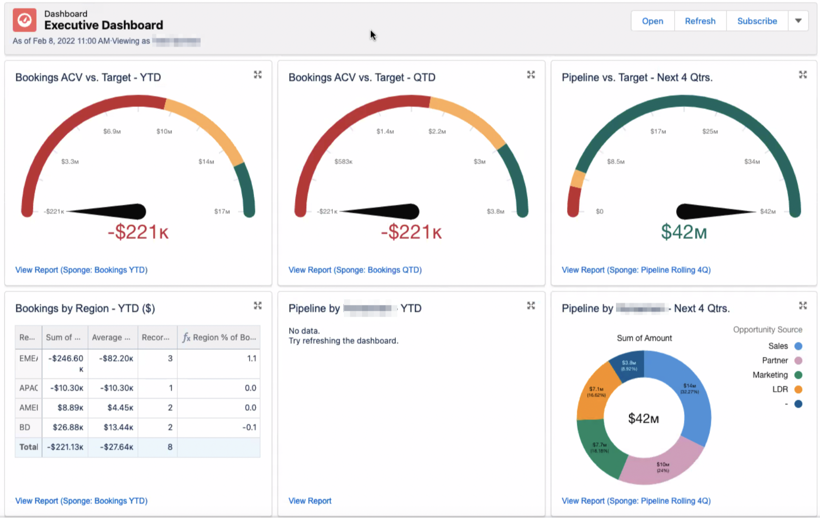
Exec overview dashboard
What we love:
- Gauges tracking bookings against quarterly and yearly targets, and the “big picture” pipeline target.
- Healthy competition in the pipeline attribution doughnut chart.
“Top 10” deal dashboard
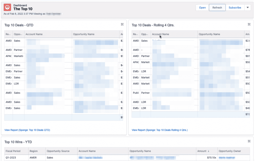

What we love:
- a quick snapshot of the most valuable opportunities this quarter vs. this year, and then the most valuable closed/won deals
Created v. Closing dashboard


What we love:
- This dashboard is similar to the Top 10 Deals, but it’s more immediate: What recently entered the pipe? What closed? What’s closing soon?
Sales leaderboard
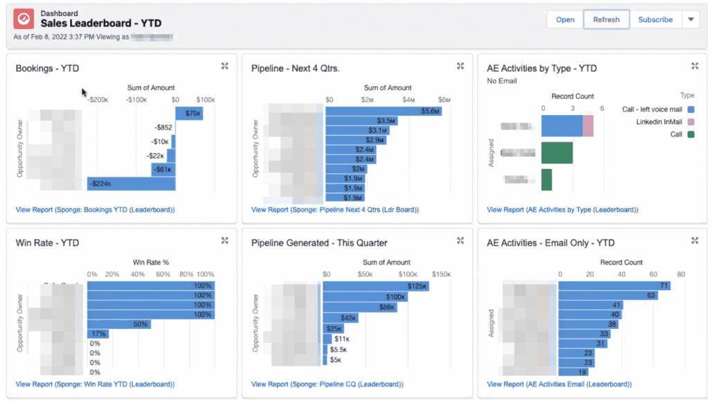

What we love:
- It’s great to see pipe this quarter vs. the rest of the year. When deals shift, it’s immediately obvious how the quarters need to be rebalanced.
- And of course, we love to see activity by type, versus individual reps’ activities. This makes it so easy to spot lumpy performance across reps, as well as if reps are actually calling and using expensive InMails.
Upcoming Sales meetings


What we love:
- This is a Sales’ managers secret weapon – a single view of all the upcoming Sales meetings. This would be the foundation of every 1:1 meeting I had with reps… are you ready for each convo?
- A simple green check to denote if it’s the first meeting with a particular company.
Weighted funnel bookings dashboard

What we love:
- Weighted funnels! Per Propeller, “your sales pipeline can be either weighted or unweighted. An unweighted sales pipeline looks at the full potential value of opportunities at every stage of the sales funnel. Each deal is considered equally likely to close, whether you’ve recently made contact via cold call or they’re ready to sign on the dotted line. This can lead to inflated revenue forecasts if high-value opportunities fall through. A weighted sales pipeline, on the other hand, acknowledges that not every opportunity results in a sale. This is a more detailed sales forecasting method that assigns a value to each deal based on where it is in the sales funnel.”
- Seeing the weighted funnel 3 ways – by expected total bookings against target, by expected revenue within each stage, and by quantity of deals within each stage
LDR activity tracker dashboard
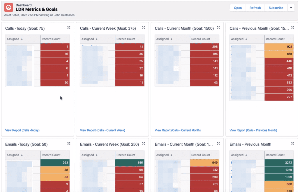

What we love:
- These daily/weekly targets offer instant gratification and are dead simple to interpret. It’s very easy to institute “you don’t go home until it’s green” guidelines, and easy for managers to spot lumpy performance.
- Also love seeing separate targets for calls vs. emails
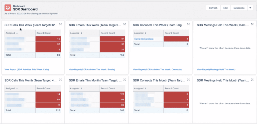

What we love:
- This SDR dashboard tracks the number of phone calls, emails, and meetings held each week/month
Tip: Make VIP dashboards your Salesforce homepage
Great reporting is not a Field of Dreams. If you build it, they… might come.
Getting the latest/greatest reports and dashboards adopted is a long journey. But one of your most powerful “nudges” to increase adoption is setting the SF homepage for each role. Now, when your execs, Sales/LDR managers, marketers, and reps log in, their most important dashboard is front and center.
Inspired? Time to make your own
If you needed this kind of Salesforce dashboard yesterday, we recommend starting with ANOTHER MEETING!?
Yes, finding consensus first was key to making each of these Salesforce dashboard examples successful. It’s time-consuming to build and endlessly fiddle reports directly in Salesforce! Often folks don’t realize what’s possible, or what constraints Salesforce has. Fielding one-off adjustment requests by email, over and over again, makes everyone cranky.
Instead, convene listening sessions among LDR, Marketing, Sales, and Leadership teams. Show them these Salesforce dashboard examples. Ask what metrics they wish they could see, in what order, and in what data viz formats. Draw a simple wireframe to help them visualize it. Once the wireframe is approved, then you’re ready to build in Salesforce.
Here’s a sample wireframe to help you get started.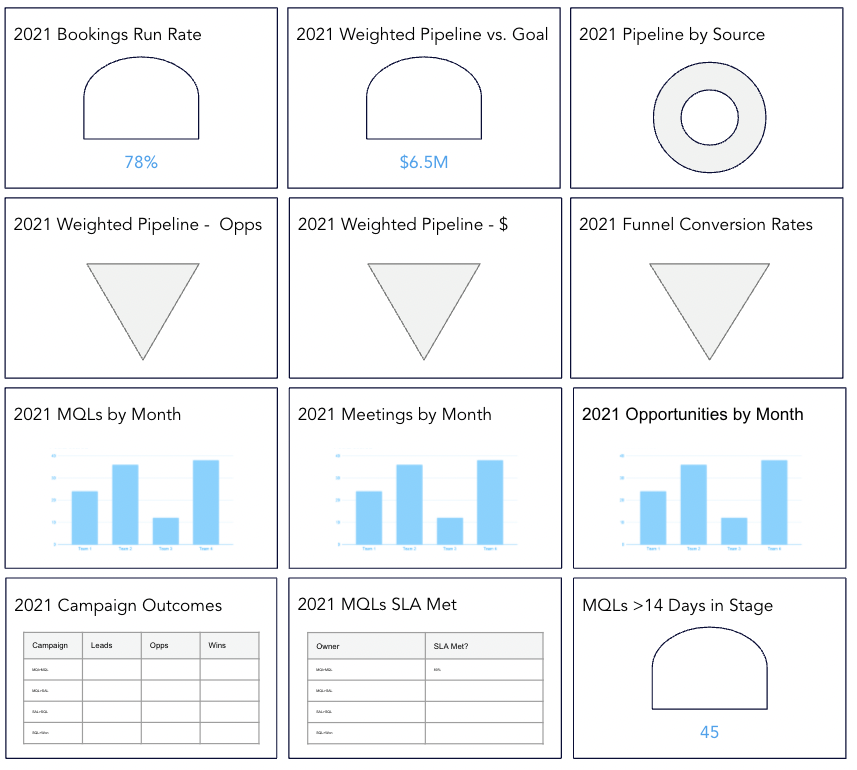

Want Sponge to help build these reports? Just get in touch ⬇️

